Climate Visuals London Masterclass – rewriting the visual story of climate change
There is a new language of photography, and the recipe for effective communication lies in seven principles
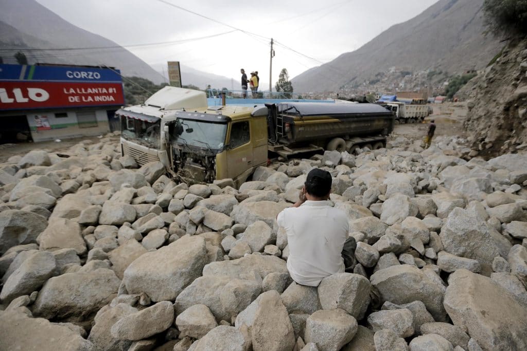
Chosica, Peru, 33km from the center of Lima, March 2015. It started with torrential rain in the mountains, followed by a wall of mud that slid around half a mile down a steep slope, crushing and destroying everything in its path, forcing hundreds of people to leave their homes, most of which were destroyed.
In the picture below, a man is sitting on a massive pile of stones in front of two trucks, holding his head in his hands and staring at the apocalyptic scene in front of him. Who is he? A husband? A father? What has he lost? His house? His job?
Lurigancho-Chosica is a district known for landslides, many of them attributed to El Niño. Local villagers used to call it “landslide season” – but in recent years these episodes have become more frequent and violent.
This single photo is suggesting “Yes, this story is about climate change”; it is telling a true story about someone who has been affected by climate change, a story that we can connect with, emotional and touching, that helps make this event feel closer to us.
Peru, Colombia, Thailand, China – we can find human stories of a changing climate everywhere in the world. Why then do we keep seeing polar bears and melting glaciers in the media, like a video stuck on repeat? Yes, global warming is a threat to the most iconic animal for climate change – always on the front line of every photo story, but isn’t it time to remake the visual representation of climate change in the public mind?
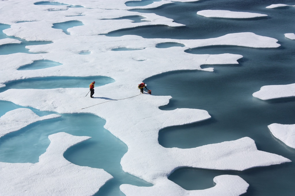
Images of melting ice have become one of the ‘classic’ climate images, and are therefore recognised as such. Arctic sea ice is not a local or familiar terrain for most people, so it is unlikely to connect with their everyday lives.
What is the recipe for successful visual communication? Climate change is a human story, that’s why it’s crucial to tell stories about people. And for this reason, images have a crucial role to play – to succeed, communicators need to put people right at the heart of their visual communication strategy. Our evidence-based 7 principles for creating new, more diverse visuals stories of climate change are:
![]()
During our inaugural masterclass – to be held on 4th September in London – we will help communicators to start thinking about a different visual approach to use when they’re creating content – for a campaign, a news story, a social media post, or an event to engage a local community.
“I’m excited to bring together our first Climate Visuals Masterclass so that we can work together towards a new visual language for climate change, “ says Adam Corner, Climate Visuals Project Manager and Research Director at Climate Outreach. “Climate change will define the 21st century, but we need a visual vocabulary that can express this – and a more diverse visual language will help catalyse public engagement.”
In our research, we found that people do not necessarily understand the links between climate change and their daily lives – such as driving a car or eating a large plate of meat – rejecting the idea that images of their normal lives could or should be associated with climate change.
“To get real reaction on climate change, people have to see that it relates to them, whether it’s a longer allergy season, higher insurance rates or cheap solar power. Pictures that tell that story can help drive the change,” spotlights Laurie Goering, Climate Change Editor at the Thomson Reuters Foundation in London, and one of the guest speakers during our event in London. But climate change is still an enormous and complex network of causes and effects that most people are unable to directly perceive. But what should we do to communicate this issue more effectively?
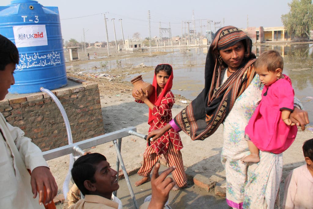
Our research found that while localised impacts can be powerful, it is important to show the scale of a flood’s impacts. People seeking clean water in the foreground add the human element to connect with the viewer.
“Climate change impacts many aspects of all of our lives, but the visuals used to illustrate this key point are often stuck in the same clichés. How well photographers, editors and communicators expand the visual language of climate change impacts, causes and solutions, will have an impact on generations to come,” outlines Robert van Waarden, our Canadian-based photography advisor, who has turned his lens on climate change. “Photographing the issues that define climate change is a tricky bridge to walk. Do we shock? Do we encourage? Do we focus on the same stories or push new ones? Who is our audience, how is it presented? These questions should be answered before choosing or commissioning visuals for any form of communication.”
No matter how much time and effort we put into our news story or campaign, if we don’t use the right image, we will never create a connection with our audience and our visual story will undermine the power of the written copy.
“I’m interested in the story we’re telling ourselves about climate change,” explains Robin Webster, researcher and co-author of our original report. “In a digital world, the images we use are a massive part of that. The question is, have we thought about what ranks of chimneys, melting glaciers, flooded towns, wind turbines and polar bears actually mean to people? Are we making climate change feel even further away from people’s day to day concerns by unthinking use of the same pictures? The iconography of climate change is stuck in a rut, and it needs to get out of it fast.”
During our masterclass, participants will gain an in-depth understanding of the Climate Visuals approach, and learn skills to design and deliver effective communication through climate photography. We will also explore how to apply this learning by critically exploring case studies and previous campaigns. On top of that, we will hear from a variety of experts in different fields, providing different perspectives and tried-and-tested advice on the challenge of telling powerful visual stories on climate change.
“It’s sometimes hard to picture what climate change looks like,” highlights Laurie Goering, “until you consider that it’s in front of most of us every day, in everything, from more heatwaves and worsening floods to electric buses and jobs installing solar panels. It’s time to move away from photos of smokestacks and polar bears and tell that broader story that more people can relate to.”
One response to Climate Visuals London Masterclass – rewriting the visual story of climate change
Sign up to our newsletter
Thank you for signing up to our newsletter
You should receive a welcome email shortly.
If you do not receive it, please check your spam folder, and mark as 'Not Spam' so our future newsletters go straight to your inbox.
It is indeed a very powerful forum. I believe that a judicious mix of visuals with text can have more impact than either of them alone. However, though the seven points mentioned are essential to develop the language , perhaps many of the impact making photos are spontaneous reaction without a conscious design for the choice of the subject. Even if they don’t satisfy any or all seven criteria listed, they need to be highlighted and appreciated. The language will acquire new vocabulary , and the effort will be sustained in a manner any language develops with more expressive power with creative inputs that may not necessarily be consistent with the current grammar. .