Guest Blog: Rethinking data visualisation
In a striking scene in the film An Inconvenient Truth, Al Gore mounts a hydraulic platform so he can be lifted into the upper reaches of a giant graph of atmospheric CO2 concentration over time.
That’s state of the art climate communication, circa 2006. More than a decade later, we’ve thought harder about how to do it, with a growing body of research-based advice on how to mix words, images and data graphics to best effect. We’ve had a bunch of useful reports just recently geared to the IPCC’s latest reporting on the 1.5℃ target, not least the handbook produced by Climate Outreach for IPCC Authors.
Most of this advice is great. How to understand audiences? How to tell stories that engage? How to show data clearly? All taken care of. Is there anything to add?
We think there is. Real World Visuals is a small data visualisation outfit that specialises in quantitatively rigorous, science-based image and film-making, helping people relate more directly to abstract data. As we ponder climate change communication, we agree with pretty much all the advice that’s been published.
Some of it can be developed a bit more, though. Take this enjoinder, in the second headline recommendation from the IPCC guide just published:
“Talk about the real world, not abstract ideas – Although they define the science and policy discourse, the ‘big numbers’ of climate change (global average temperature targets and concentrations of carbon dioxide) don’t relate to people’s day-to-day experiences. Start your climate conversation on common ground, using clear language and examples your audience is likely to be familiar with.”
Well, yes. Except that it’s not exactly straightforward to find examples of concentrations of carbon dioxide that people are familiar with. And if there’s more of it, it does not register on the human senses until we’re in danger of suffocation. This is the awkward fact that had Al Gore climbing on that hoist. Carbon dioxide, like the other greenhouse gases, is invisible. As Richard Hamblyn and Martin Callaghan remark in Data Soliloquies, “Increases in atmospheric greenhouse gases occur invisibly, and though they can be measured and plotted on scary-looking graphs, the fact of their invisibility remains a constant barrier to action. If the sky changed colour as a result of increased carbon dioxide, there wouldn’t be a problem now.”
But how to overcome that gaseous invisibility? Our approach draws on our wider thinking about how people relate to presentations of quantity (explained in more detail here). The key thing, we’ve found, is to represent a quantity physically, rather than just numerically. More, the physical representation needs to be on a scale that is comparable to the ones we relate to in everyday life. We intuitively relate to things that happen on a bodily scale and tempo. Things happening outside that realm are harder to engage with. That goes with the invisibility problem to ensure that most people have no sense of ‘how much’ a kilogram or a tonne of carbon dioxide is.
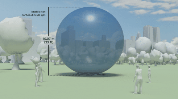
We’ve done lots of visualisations of carbon emissions now – from global output to greenhouse gas produced by a whole city, a single building, or an individual car. An approach that seems to work is to translate mass into volume, and display volumes against a backdrop that helps people grasp their scale.
Like this, which shows one metric tonne of CO2 at atmospheric pressure:
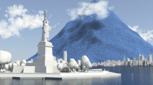
Pile those up, and you can depict a day’s worth of global emissions, like this:
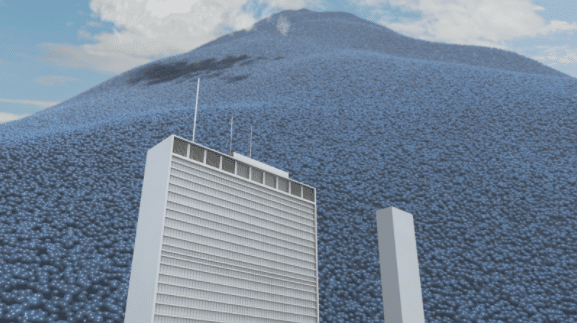
Or, perhaps giving a better sense of scale, like this:
This is just one example of an approach that, cumulatively, begins to allow one to ‘see’ carbon dioxide as a presence in the world. It isn’t a substitute for the excellent image libraries about climate change, such as the one on this site, but can complement them. One does notice, for instance, that images of causes – as opposed to consequences – of climate change still lean heavily toward smokestacks (or plumes of steam) as surrogates for the actual greenhouse gas that we are concerned about. The carbon dioxide, as ever, remains invisible in the photos.
And one can build on this approach to help instill new intuitions about local emissions, as we have done with a simple real-time emissions tool, which allows anyone to create a moving image of CO2 emissions by entering some basic data.
We still admire Al Gore for having the chutzpah to be hoisted aloft while talking to a live audience and being filmed. But we like to think we could offer him other ways to make his point now.
Guest blog by Jon Turney, Real World Visuals
References:
Principles for effective communication and public engagement on climate change: A Handbook for IPCC Authors. Climate Outreach, January 2018
Richard Hamblyn and Martin Callaghan, Data Soliloquies, UCL Environment Institute, 2009, p41.
Images: Real World Visuals
Sign up to our newsletter
Thank you for signing up to our newsletter
You should receive a welcome email shortly.
If you do not receive it, please check your spam folder, and mark as 'Not Spam' so our future newsletters go straight to your inbox.